SPEAKING OF ESTATE AGENCY, WHAT ABOUT A NEW BRAND ARCHITECTURE?
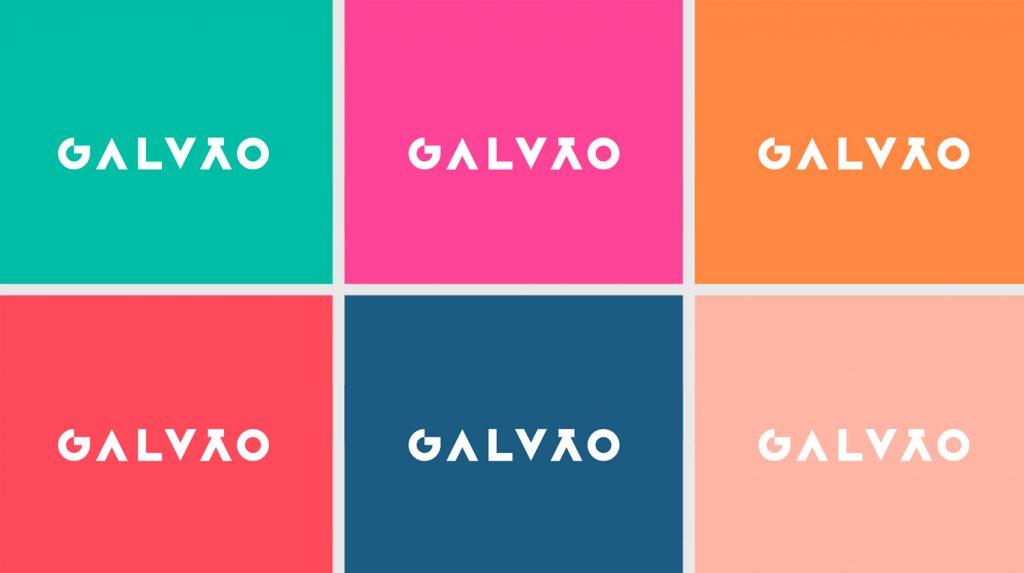
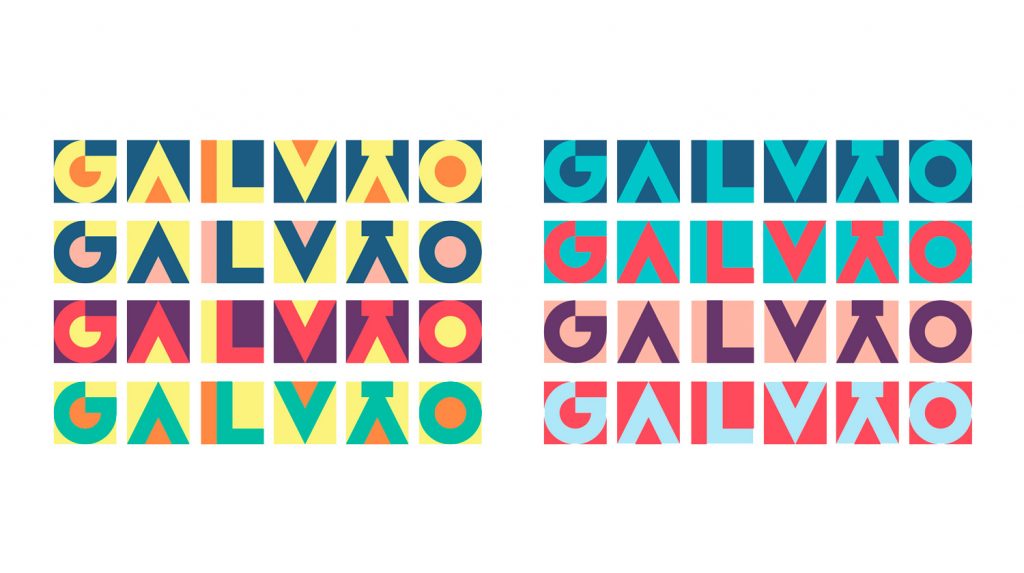
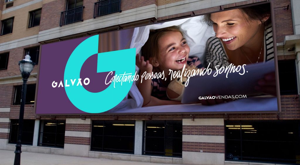
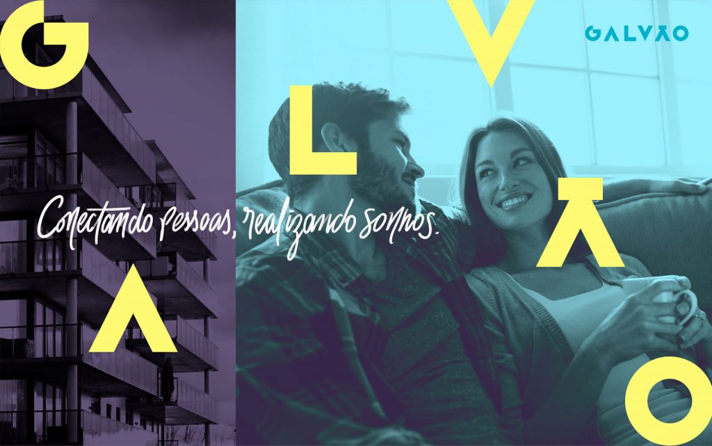
Imagine a scenario where clichés multiply. That’s how estate agencies used to present themselves. The change happened when Brasil Brokers became Galvão Vendas. This required a new identity aligned not only with its name, but mainly with the agency’s new phase. So, we sought an identity that wouldn’t rely on an icon, that expressed the joviality of a new proposal, fully responsive, dialoguing with different media.

Local estate agencies have always opposed to seeking diversity in design. This has always made the brands very similar to each other. The same old approach has inspired us to create an identity out of the ordinary.
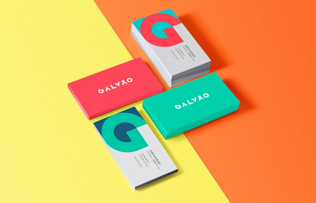
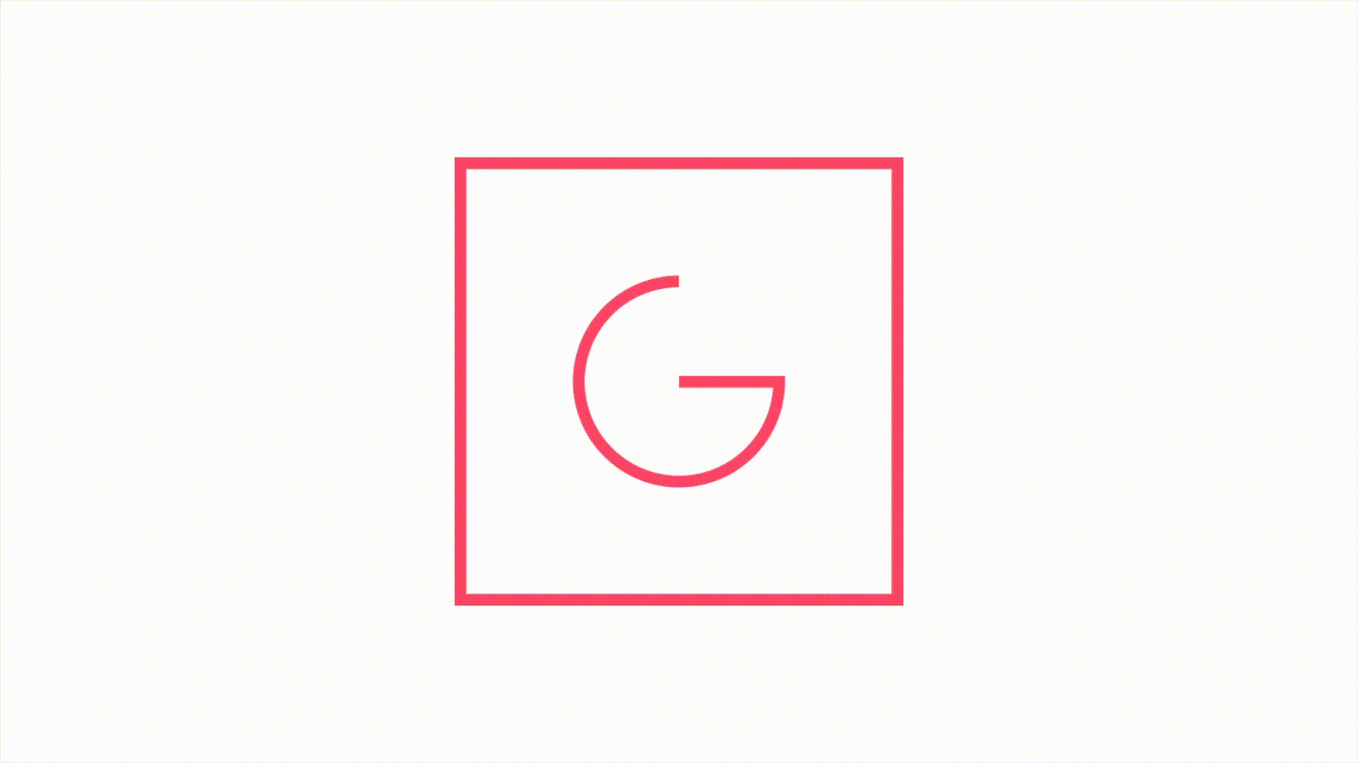
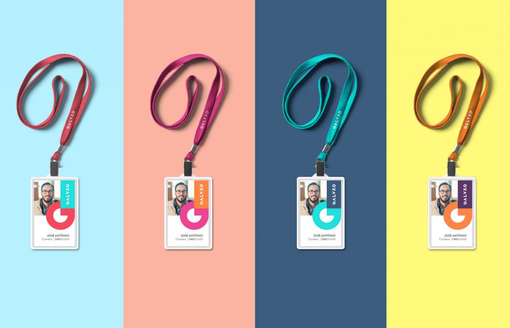
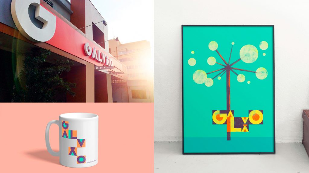
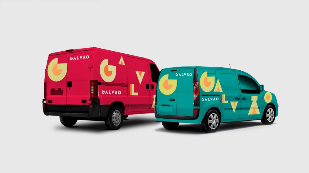
To begin with, the Galvão symbol gives rise to a striking type that easily fits into different contexts, showing Galvão Vendas’ ability to adapt, providing mobility and dynamism in its application.


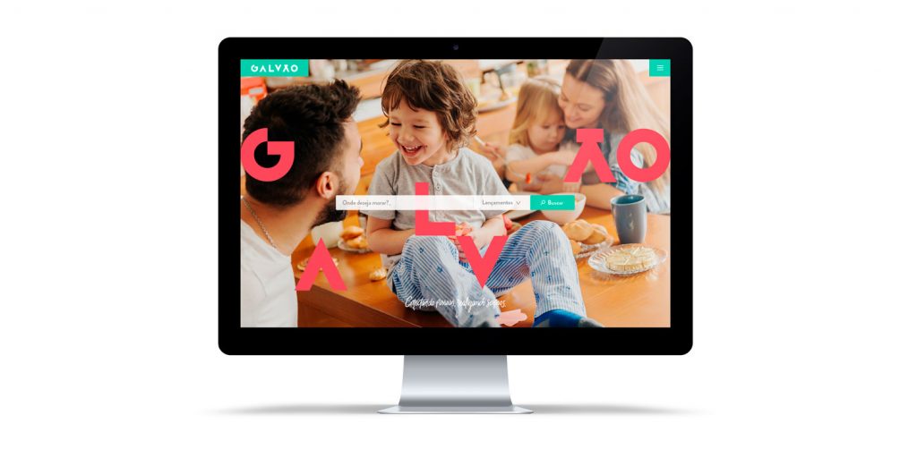
Additionally, the new website developed by BlaBlu followed this innovation proposed by the brand, bringing a new way of interaction between user and estate agency.